TROVE Swift Slim Review
Taking out your most-used card is easy with the Trove Swift Wallet’s pull tab, though we’re curious to see how well the elastic holds up over time.
Our Verdict
Save time. Get access to brief summaries of our reviews so you can browse and make decisions more efficiently.
Pros
- Barely bigger than the cards you store inside it
- The pull tab is super easy to use and quickly deploys the cards you need
- A separate third slot for cash is a more elegant solution versus a clip or a band
Cons
- It’s hard to sift through cards in the middle compartment
- The elastic could get loose after years of repeated stretching
- The pull tab’s upside-down orientation relative to the logo takes some getting used to
Technical Details
-
Weight (oz)
0.56 oz (15.9 g)
-
Dimensions
2.25 in x 3.5 in x .5 in (5.7 x 8.9 x 1.3 cm)
-
Notable Materials
Carbon Fiber, Elastic
-
Manufacturing Country
United Kingdom
-
Warranty Information
Full Review
Those searching for the best minimalist wallet are often treated to very nifty designs. A small, easy-to-pocket size is the cost of entry, and, as such, brands have limited room to pack as much functionality as they can. Thus, we’re curious to see the Trove Swift Wallet’s approach with size constraints in mind.
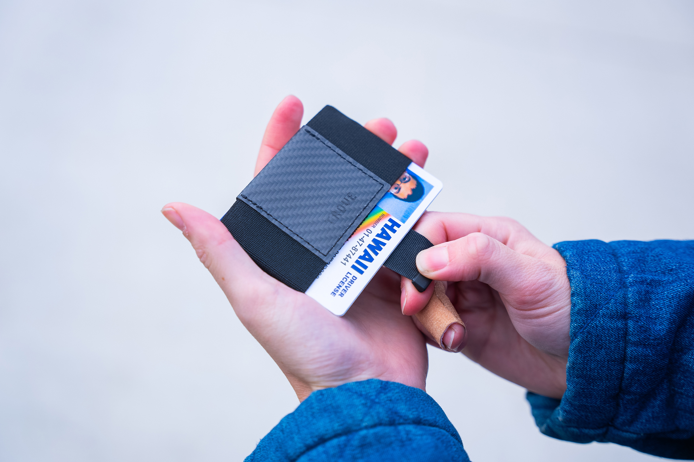
It has the basic traits of a minimalist wallet, such as thin and light materials and card-focused organization. Where it stands out is how it deploys cards and how it organizes them, employing a three-compartment layout.
Ready to see it in detail? Let’s dive in.
The Rundown
Starting with the materials, the Swift goes all in on minimalism. It is composed mostly of an elastic band held together by the central accent piece. This accent piece changes depending on the version/colorway you choose, and we’ve opted for the Carbon Fibre one. It gives the wallet a sleek look and sort of distracts from the fact that the elastic may stretch out over time.
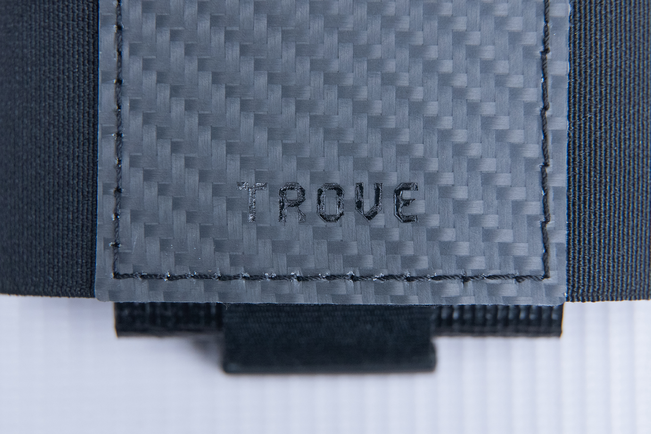
It’s a particular worry for us since other minimalist wallets we’ve tested that rely on elastics have gone loose to varying degrees. Out of the box, though, the Swift’s elastic feels tight, and two weeks of testing hasn’t changed that in a perceivable way. Overall, despite long-term apprehension, this is well-made for a minimalist wallet. It’s worth noting that this wallet is handcrafted in England and made from carbon fiber sourced from the U.S., while the elastic is of Italian origin—it’s a well-traveled wallet if nothing else.
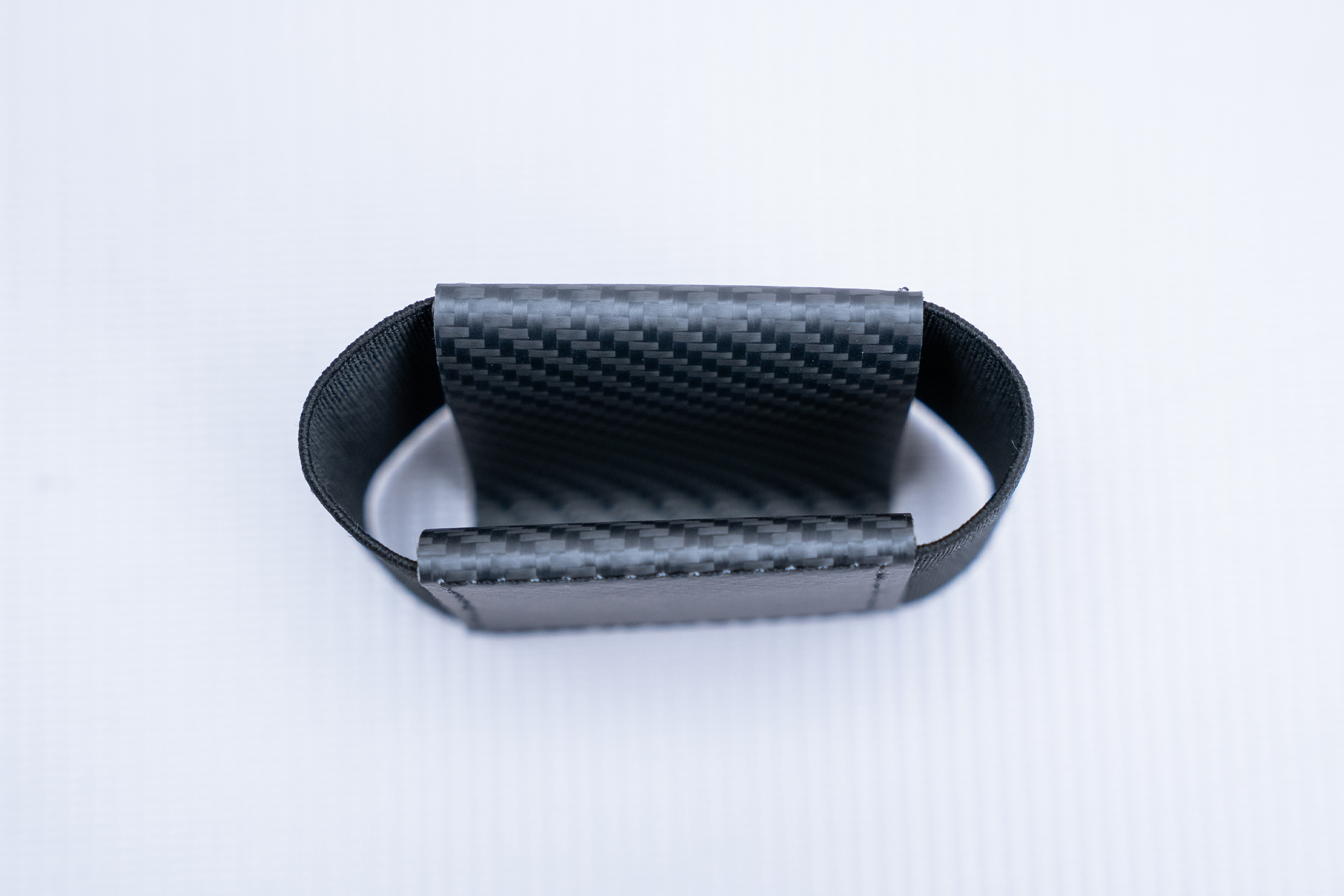
Trove was able to weave a three-compartment layout despite the limited resources they chose to use (it’s just an elastic and carbon fiber piece, remember). “Weave” is an apt term to use, as the elastic is flexed into a V form. With the carbon fiber piece wrapping around, this results in a front quick-draw pocket, a main compartment in the middle, and a back slot.

The main compartment in the middle has the widest opening and, therefore, gets the lion’s share of the wallet’s capacity. In total, Trove rates this wallet’s capacity at ten cards. Let’s say you put two in the front and one in the back; this means you can put around seven cards in the middle.
That’s nothing to scoff at, capacity-wise. That said, sifting through the cards you placed in this compartment is rather tricky because of the elastic. We understand that it has to be tight to make sure your cards don’t just slip out and go AWOL. However, this also means fanning the cards out requires struggling against the elastic. The other two pockets don’t suffer as much, though they both share a quirk.
The front pocket and back slot’s opening are both on the opposite side due to the elastic’s V arrangement. This orients them upside down relative to the logo and the main compartment’s opening. The problem begins whenever we pull the wallet out and instinctively orient the main compartment and logo up, which is fine. However, we can’t shake that weird feeling when we have to either pull the front pocket’s tab downward or pull something out of the back slot. It’s not a huge deal, just something to get used to.
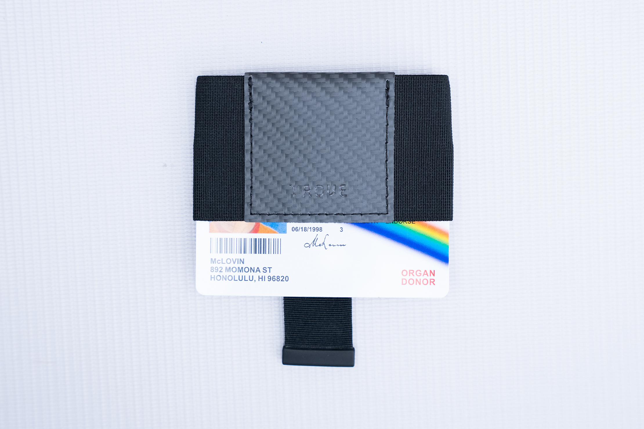
Speaking of the front pocket, it handles the quick-access functionality of the Swift for your most often-used cards. The built-in pull tab sits below the two cards we usually place inside. To raise them, simply pull it, and you can take them out. It’s a very simple system, which we’ve seen on other minimalist wallets. The only downside to this (apart from the orientation quirk we mentioned above), is that the pull tab creates a noticeable bump that slightly bends the cards you put in this pocket. It’s not a huge deal for thick cards. However, if you have one that’s pretty worn, cracked, and faded, maybe have your bank issue you a new one first before putting it here.
Meanwhile, the back slot can either be used for cash or a card-shaped smart tracker. We chose the latter, though the former is viable. That said, you’ll have to be willing to fold and unfold your cash each time you do this.
Lastly, say you want to pool all your cards into one compartment (i.e. turn the Swift into a pure card holder). Well, you can turn the Swift inside out, changing that V-shaped arrangement we described above into a U-shaped one. We don’t find this particularly useful for travel since you’re trading the pull tab’s functionality for sheer capacity.
Packability
Packability-wise, you’ll have no issue fitting this wallet into most pockets, whether it’s the front pocket of a day sling or your pants’ pocket.
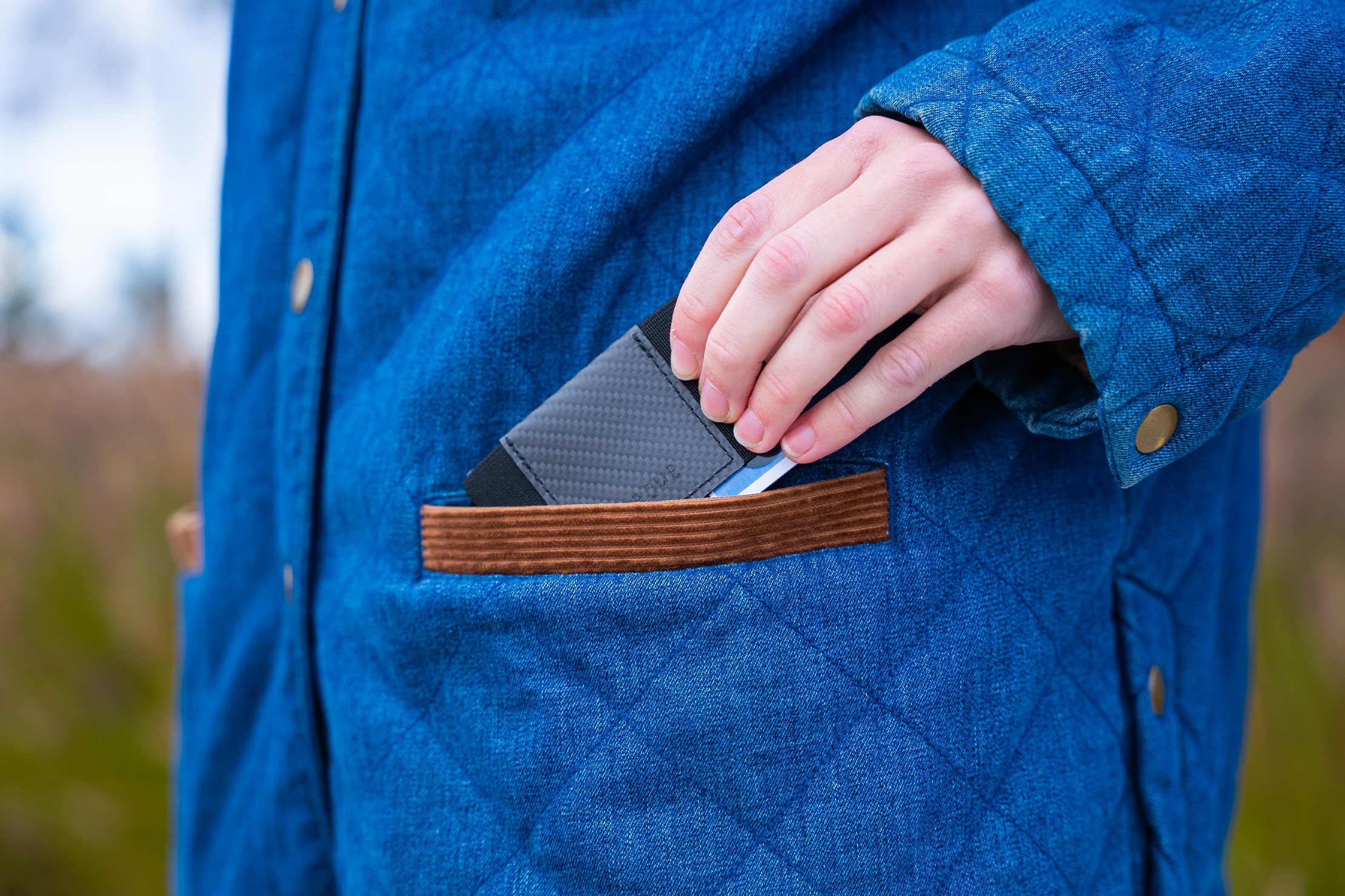
The overall size isn’t really that much more than the cards you’re storing inside, which means you’re only pocketing what you want to bring. Some wallets feel much bulkier than your cards, but that’s not the case with the Swift.
Quick Comparison
In many ways, the Swift reminds us of the NOMATIC Wallet, so that’s the one we’re comparing against. The comparison isn’t exactly fair since the NOMATIC Wallet’s worn out (we’ve used it a lot), but we’re focusing on functionality here. As an aside, though, its looseness shows how the Swift might potentially stretch out in the future.
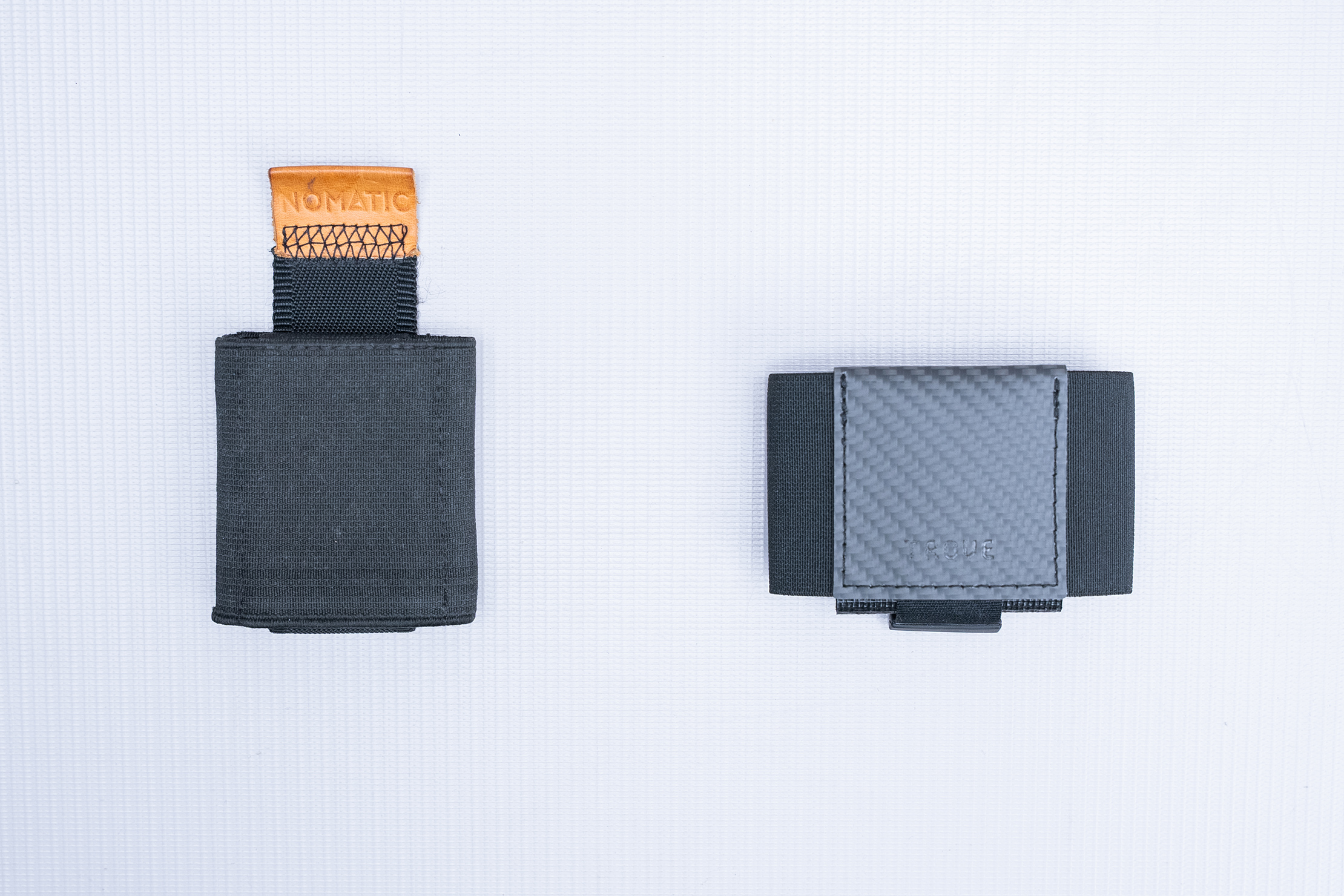
The NOMATIC Wallet wins out in overall capacity since it’s rated for up to fourteen cards and has the same pull-tab feature as the Swift. The organization is also quite similar since the NOMATIC Wallet also has a pocket for cash and another pocket for extra cards. The difference here is that the main compartment gets the pull tab feature, while the pocket for extra cards is just a plain pocket.
Usage Timeline
Condition: Excellent
- Unique reversible design gives you two storage combinations in one
- Carbon fiber feels somewhat plasticky but durable
- Curious to see how easy access is when it’s fully stuffed
Condition: Excellent
- Holding up great, with no visible stretching on the elastic
- Don’t find the reversible design super functional for our use cases
- Slim design fits in basically any pocket


Get your questions about the TROVE Swift Slim answered from our team and the Pro Community right here on the page. Plus, join discussions with other members about gear, guides, and more.
Join Pack Hacker Pro or, Sign In